
Connect with us
Corporate Video
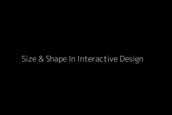
Size & Shape In Interactive Design
We can describe Fitts’s Law as:
“…a model of human movement in HCI and ergonomics which predicts that the time required to rapidly move to a target area is a function of the distance to and the size of the target.”
As interaction designer Anastasios Karafillis points out, Fitts’s Law must be executed with subtlety. Interaction design is meant for people, which means that you need consistency, enjoyment, accessibility, and discover-ability — none of which can just be calculated with clicks or pixels.
Minimize Physical Exertion
Fitts’s Law originated as a way to analyze physical exertion, and it wasn’t until later that his principles were reinterpreted to apply to web design. However, with their physical gesturing, mobile devices are actually more attuned to what Fitts was actually studying. Whether you interpret his studies loosely for web design or literally for mobile design, in both cases, Fitts’s Law states that less exertion leads to a better UX.
Mobile design has a lot more muscle and fatigue concerns than web design, so it’s important to keep them in mind to completely optimize your UX. Justin Smith, UX Architect for Cartoon Network, explains that the problem is further complicated by the different screen sizes each having their own different issues. But if you’ve been paying attention to the points of Fitts’s Law, you’ll have no problem applying them to the muscle movements of mobile devices.
Smaller screens tend to put more strain on the hand muscles, but 7” devices, while bigger and heavier, are easier to manipulate. One point to keep in mind with 7” screens is that, in the vertical orientation, most people will hold it at the the top. This makes the top two corners the best places for actionable targets.
For example, when you want to remove a field in the relationship management tool Relate-IQ, the modal window actually prompts you to type in “DELETE THIS FIELD”. From our experience with the tool, this dramatically decreases the likelihood of deleting due to the effort required.
Take Deviant Art’s favoriting method: if a user clicks on a picture and drags slightly, the Favorite toolbar drops down on screen, allowing the user to simply “drop” the picture in. While most other sites have clickable options for their Favoriting system, the advantage to this one is that it hides the controls interface until needed, saving valuable screen real estate on a site that relies heavily on displaying as many graphics as possible.
Create Generous Clicking Space
The loosest interpretation of Fitts’s Law is to make your key elements larger so that it’s easier for your users to click them. As we discussed in the free e-book Interaction Design Best Practices Vol. 1, this is mostly an oversimplification.
There are at least two universal truths an interaction designer can take from this:
- Make top-priority buttons larger — Whether relatively larger in comparison to the rest of the page, or just plain large, an increase in size will attract attention, show significance, and make it physically easier for your user to choose the target.
- Make the clickable area of a button as large as possible — In other words, make the whole button clickable, not just the text within the button. You can in the example from Mailchimp below that the entire region is clickable, not just the text.
Drawbacks to relying on excessive size
- Taking up too much screen real estate
- Throwing off the balance of the entire page
- Creating clutter
When determining size, it’s important to remember that increasing a button’s size does not increase its usability linearly.
Post Author

Vivek Adatia
Vivek is a seasoned writer and technology aficionado at WebCluses Infotech, who has a knack for crafting captivating content. He strives to keep readers informed about the latest trends and advancements in the ever-evolving world of software development & technology. His concise yet insightful articles offer valuable insights, helping businesses looking for a digital transformation.


Build Your Agile Team
Hire Skilled Developer From Us
undefined
undefined
undefinedOur Recent Blogs
Sharing knowledge helps us grow, stay motivated and stay on-track with frontier technological and design concepts. Developers and business innovators, customers and employees - our events are all about you.
Contact
Information
India
Ahmedabad
1007-1010, Signature-1,
S.G.Highway, Makarba,
Ahmedabad, Gujarat - 380051
Rajkot
1308 - The Spire, 150 Feet Ring Rd,
Manharpura 1, Madhapar,
Rajkot, Gujarat - 360007
UAE
Dubai
Dubai Silicon Oasis, DDP,
Building A1, Dubai, UAE
USA
Atlanta
6851 Roswell Rd 2nd Floor,
Atlanta, GA, USA 30328
New Jersey
513 Baldwin Ave, Jersey City,
NJ 07306, USA
California
4701 Patrick Henry Dr. Building
26 Santa Clara, California 95054
Australia
Queensland
120 Highgate Street,
Coopers Plains,
Brisbane, Queensland 4108
UK
London
85 Great Portland Street, First
Floor, London, W1W 7LT
Canada
Burlington
5096 South Service Rd,
ON Burlington, L7l 4X4
Let’s Transform Your Idea into
Reality. Get in Touch